February 19, 2026


Google's AI Overviews feature uses distinctive visual branding to signal AI-generated content in search results. The sparkle icon (✨) and Gemini-inspired design elements help users distinguish between traditional search results and AI-synthesized answers. Understanding these visual cues matters for SEO professionals monitoring where their content appears and how Google presents AI-synthesized summaries.
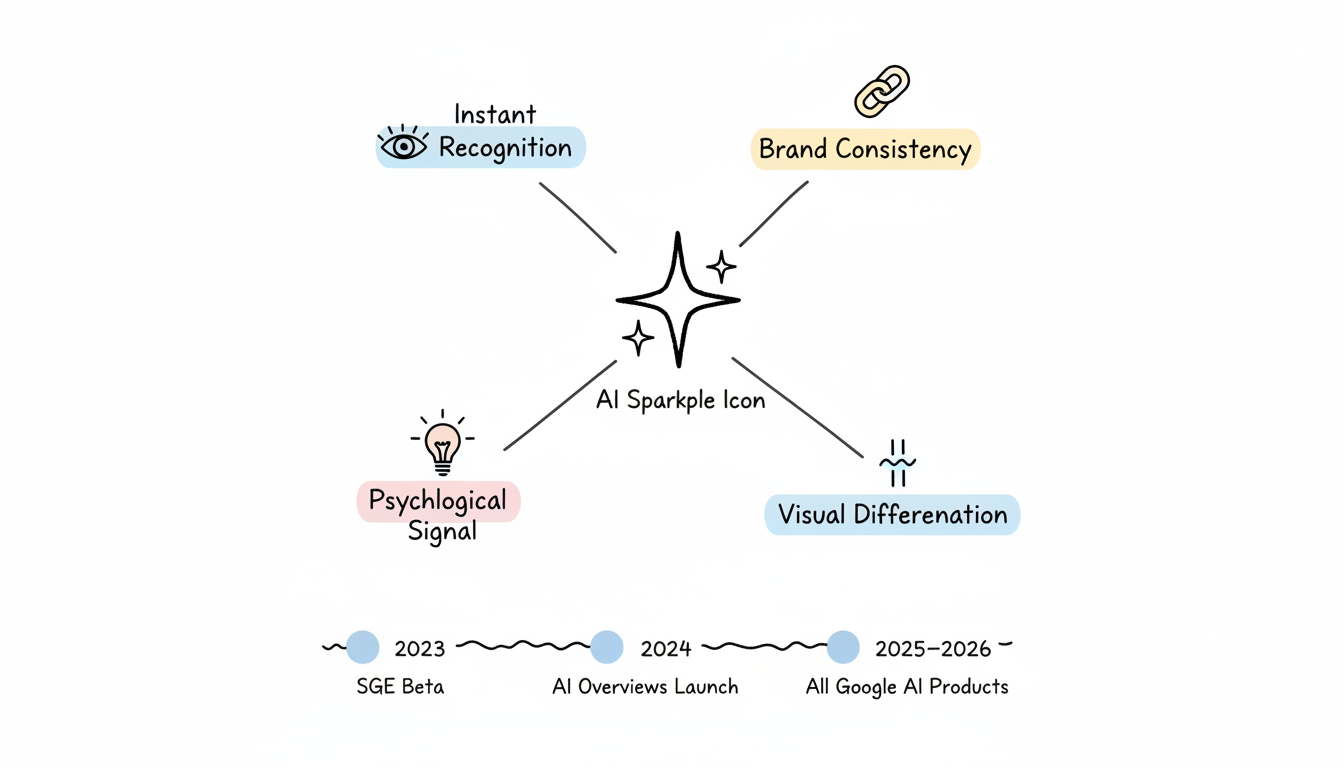
The sparkle icon has become the universal signifier for AI-powered features across Google's products. This four-point star symbol appears whenever AI Overviews generate content in search results.
Google adopted the sparkle for several strategic reasons:
According to Google's design team, the sparkle evolved from experimenting with the iconic four-color dots that represent Google's brand identity. The goal was creating "a dynamic, fluid expression of AI intelligence" while maintaining familiarity with established Google visual language.
The current sparkle icon represents years of iteration:
The design draws from Material Design principles, featuring rounded corners and smooth gradients that echo Google's broader visual identity. As generative search engine optimization becomes more important, understanding these visual signals helps marketers track their content's performance in AI-powered search experiences.
AI Overviews inherit visual DNA from Google's Gemini AI brand, creating cohesion across the AI product ecosystem.
Color Gradients: AI Overview containers often feature subtle gradient backgrounds that match Gemini's color palette—typically blues, purples, and soft neutrals that signal AI involvement without overwhelming the content.
Rounded Containers: The boxes containing AI-generated summaries use rounded corners consistent with Material Design. These containers visually separate AI content from traditional SERP elements like blue links and featured snippets.
Typography Choices: AI Overviews use Google Sans or similar fonts with slightly different spacing than standard search results, creating subtle but noticeable differentiation.
The "Show More" Interaction: AI Overview cards often collapse by default, with expansion options that reveal additional AI-synthesized content. This interaction pattern reflects Gemini's approach to layered information disclosure.
Understanding how Google positions AI Overviews visually helps SEO professionals assess their impact on click-through rates. Research on AI overview CTR data reveals how these visual elements influence user behavior and engagement patterns.
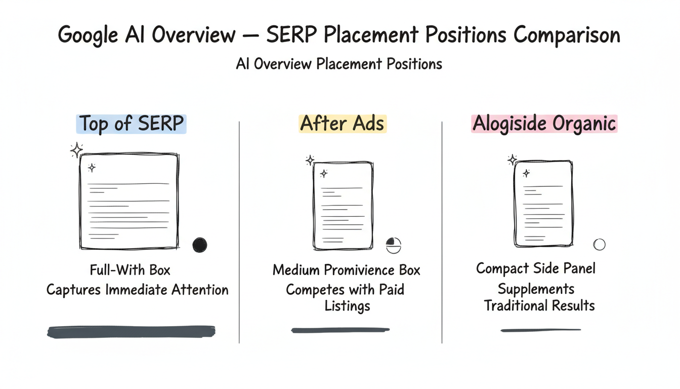
AI Overviews typically appear in one of three positions:
Position | Visual Treatment | User Behavior Impact |
Top of SERP | Full-width box with prominent sparkle | Captures immediate attention |
After Ads | Medium-prominence box | Competes with paid listings |
Alongside Organic | Compact side panel | Supplements traditional results |
When AI Overviews cite sources, the visual treatment includes:
These visual elements help users understand where information originates—and provide opportunities for brands to gain visibility even without traditional #1 rankings.
Google's visual choices reveal strategic positioning for AI in search.
The prominent sparkle icon and distinct containers serve as "transparency theater"—Google visibly marking AI content to address concerns about synthetic information. As one industry analysis noted, the sparkle essentially says "trust us" while acknowledging the content differs from traditional indexed results.
The visual treatment positions AI Overviews as complementary to traditional search rather than replacement. The design:
When AI Overviews load, users see animated elements—often pulsing dots or flowing gradients—that represent the AI "thinking." This borrowed from Gemini's interface design creates anticipation and signals active processing.
Understanding AI Overview branding helps with several practical considerations, particularly for implementing knowledge graph SEO implementation strategies that improve citation opportunities.
When tracking whether your content appears in AI Overviews, look for:
For reporting and analysis, capture:
When explaining AI Overviews to stakeholders:
Visual branding for AI search continues evolving as the technology matures.
Industry observers note that as AI features become standard, the distinctive visual treatment may fade. Currently, the sparkle and special containers serve to highlight novelty. Over time, AI results may integrate more seamlessly—similar to how featured snippets evolved from highlighted boxes to standard SERP elements.
For now, the sparkle remains the key visual signal that AI is involved in generating search results. SEO professionals should understand this iconography when analyzing SERPs, creating reports, and explaining AI search impacts to clients.
By submitting this form, you agree to our Privacy Policy and Terms & Conditions.