February 19, 2026


LinkedIn single image ads remain the most popular ad format on the platform, delivering reliable engagement for brand awareness and lead generation campaigns. Getting the specs right prevents cropping, maintains image quality, and ensures your ads display professionally across all devices. This guide covers the exact LinkedIn single image ad size requirements and best practices for 2026.
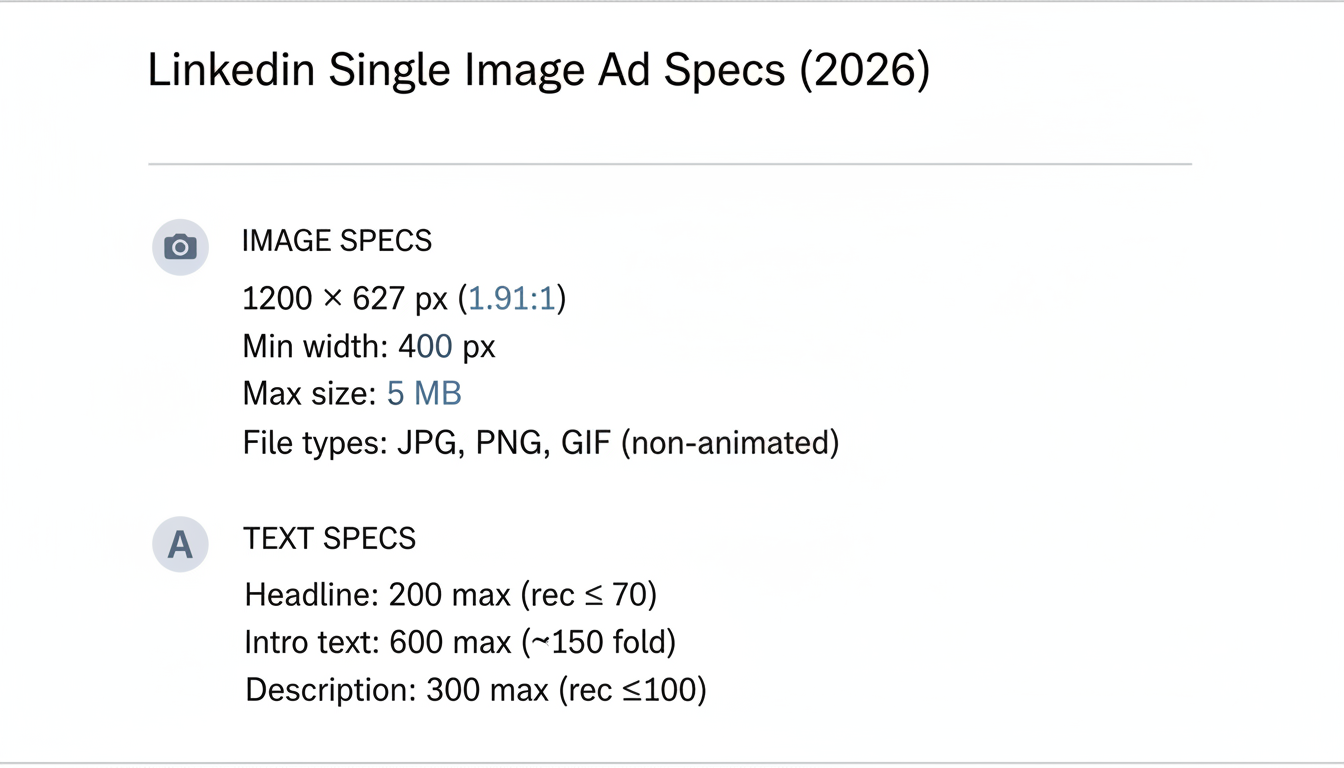
Here are the current specifications for LinkedIn single image ads:

Specification | Requirement |
Recommended size | 1200 x 627 pixels |
Aspect ratio | 1.91:1 |
Minimum width | 400 pixels |
Maximum file size | 5 MB |
File types | JPG, PNG, GIF (non-animated) |
Element | Character Limit | Recommendation |
Ad headline | 200 characters max | 70 characters or less |
Introductory text | 600 characters max | 150 characters above fold |
Description | 300 characters max | 100 characters optimal |
According to LinkedIn's 2026 ad specifications, using the 1.91:1 aspect ratio ensures your image displays fully without unwanted cropping across desktop and mobile feeds.
Single image ads deliver consistent results because they balance simplicity with impact.
According to LinkedIn advertising analysis, single image ads provide:
Metric | Single Image Performance |
Engagement level | Moderate |
Best use case | Brand awareness, updates |
Setup complexity | Low |
Creative requirements | Simple |
Ideal scenarios:
Less ideal for:
Visual quality and composition determine whether your ad stops the scroll. When building out LinkedIn advertising campaigns, your image choice can make or break performance.
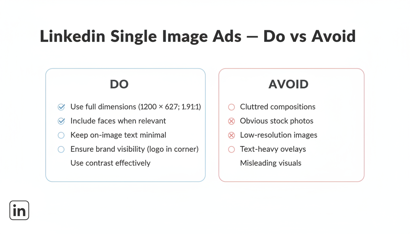
1. Use the full dimensions Upload at 1200 x 627 pixels minimum. Images below this size may appear pixelated or stretch awkwardly.
2. Include faces when relevant Ads featuring real people increase engagement by 20-30%. Use authentic photos, not obvious stock images.
3. Keep text minimal on images LinkedIn is a text-friendly platform—your caption does the heavy lifting. Limit on-image text to key messages or statistics.
4. Ensure brand visibility Include your logo, but don't make it the focal point. Position in a corner where it supports rather than dominates.
5. Use contrast effectively Your image competes with a busy feed. Use contrasting colors to ensure visibility without being jarring.
Your text elements work together with visuals to drive action. If you're planning comprehensive campaigns, consider reviewing proven LinkedIn advertising templates to structure your messaging effectively.
Effective formulas:
Keep headlines under 70 characters to ensure full visibility on mobile devices.
The intro text appears above your image. Structure it for scanning:
First 150 characters matter most—that's what displays before "see more" truncation.
Effective structure:
Example:
"Most B2B companies waste 40% of their LinkedIn budget on the wrong audiences.
We analyzed 500 campaigns to find what actually works.
Download the free guide →"
LinkedIn offers several CTA button options:
CTA Button | Best For |
Learn More | Educational content, blog posts |
Download | Ebooks, whitepapers, guides |
Sign Up | Webinars, newsletters, free trials |
Register | Events, demos |
Request Demo | High-intent conversion |
Get Quote | Pricing-focused offers |
Apply Now | Recruitment ads |
Match your CTA to the actual landing page action. Mismatched CTAs hurt conversion rates.
Here's what works across different campaign objectives:
Visual: Team photo or office scene showing company culture Headline: "Meet the Team Behind [Company]'s Growth Platform" Intro: Behind-every-great-tool story CTA: Learn More
Visual: Report cover mockup or data visualization Headline: "2026 B2B Marketing Benchmarks Report" Intro: Stats that highlight report value + download offer CTA: Download
Many LinkedIn lead generation companies use this format to capture high-intent prospects with targeted content offers.
Visual: Blog post featured image with key stat overlay Headline: "Why Your LinkedIn CPL Increased 40% (And How to Fix It)" Intro: Problem-agitation-solution hook CTA: Learn More
Visual: Product screenshot or demo preview Headline: "See How [Product] Reduces Reporting Time by 80%" Intro: Pain point + transformation promise CTA: Request Demo
Systematic testing improves performance over time.
Priority order:
Understanding how much LinkedIn ads cost helps you allocate sufficient budget for meaningful testing.
Metric | What It Tells You |
CTR | Creative engagement |
CPC | Cost efficiency |
Conversion rate | Landing page alignment |
CPL | Overall efficiency |
Using square images (1:1) in single image ad placements causes awkward cropping.
Fix: Always use 1.91:1 ratio (1200 x 627 pixels) for single image ads.
Long headlines and intro text get cut off on mobile.
Fix: Keep headlines under 70 characters; front-load key message in first 150 characters of intro text.
Images that blend into the feed get scrolled past.
Fix: Use bold colors or high contrast to stand out while remaining professional.
Overused stock photos signal "advertisement" before users engage.
Fix: Use custom photography, branded graphics, or authentic team photos.
The recommended LinkedIn single image ad size is 1200 x 627 pixels with a 1.91:1 aspect ratio. This dimension displays optimally across desktop and mobile feeds without cropping. Keep file sizes under 5 MB and use JPG or PNG formats for best quality.
While LinkedIn accepts various aspect ratios, square images (1:1) are optimized for carousel ads, not single image ads. Using a square image in a single image ad placement may result in cropping or awkward display. Stick to 1.91:1 ratio for single image ads.
Minimize text on the image itself—LinkedIn's feed is text-friendly, so your headline and intro text carry the messaging. If including text on images, keep it to one key statistic or short phrase. Heavy text overlays reduce engagement and can appear unprofessional.
By submitting this form, you agree to our Privacy Policy and Terms & Conditions.