February 19, 2026


Google's AI Overviews have introduced distinctive visual elements that signal AI-generated content to users. Understanding this visual language helps marketers recognize how Google frames AI responses—and how users perceive them in search results.
This guide examines the branding elements, iconography, and design choices that define Google's AI Overview presentation.
The four-pointed sparkle (✨) has become the defining visual marker for AI features across Google products and the broader tech industry.
According to NPR's analysis of AI iconography, Google initiated the sparkle icon trend in the mid-2010s, and it has since become ubiquitous across AI products. The sparkle now appears as part of Google's Gemini logo and throughout their AI feature suite.
Where the sparkle appears:
The sparkle icon carries specific symbolic meaning. According to design analysis from UX Collective, the four-pointed star represents "emergence" and "magic"—conveying that AI creates something from nothing, seemingly by magical means.
Symbolic associations:
This framing positions AI as mysterious and powerful rather than algorithmic and mechanical.
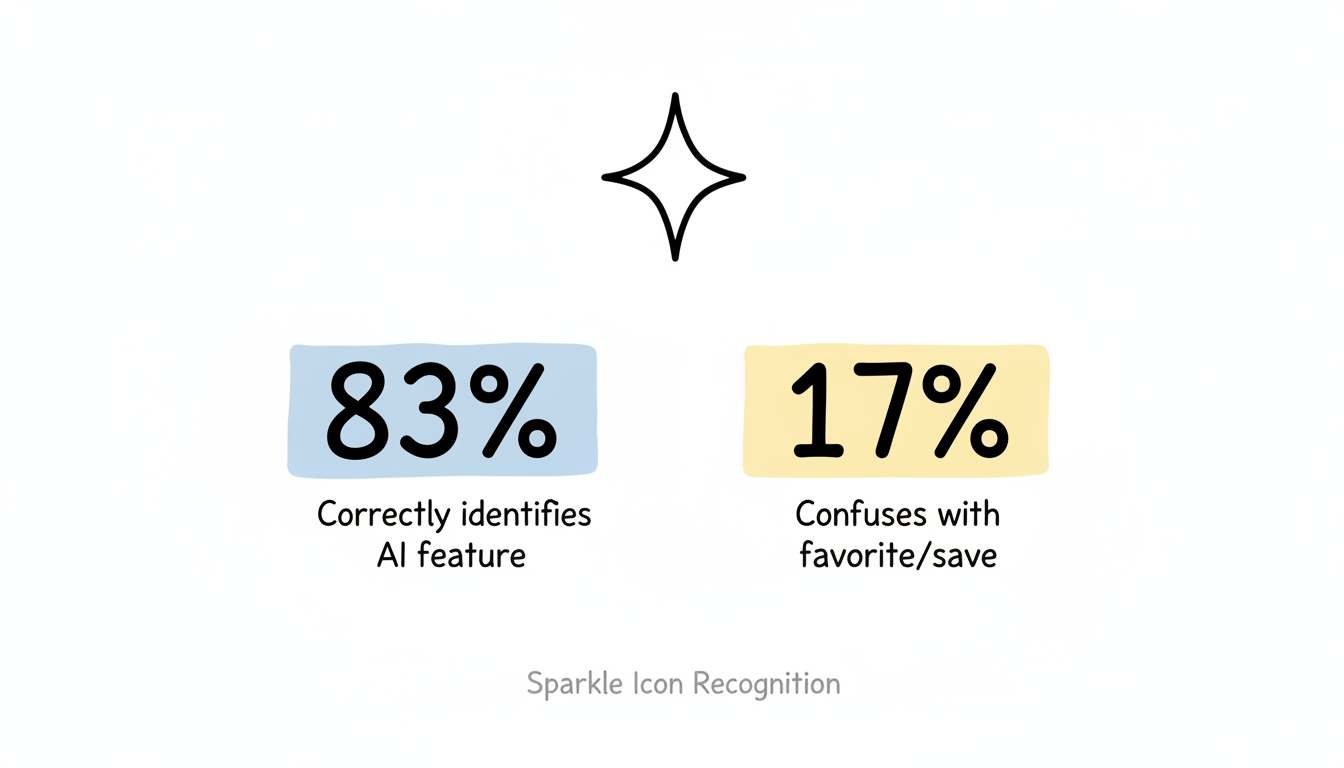
Despite widespread adoption, the sparkle icon faces recognition issues. According to research on AI iconography, approximately 17% of users still confuse the sparkle with favoriting or saving functionality because it resembles a star icon.
Icon Interpretation | User Percentage |
Correctly identifies AI feature | 83% |
Confuses with favorite/save | 17% |
This recognition gap highlights the challenge of establishing new visual conventions in digital interfaces.

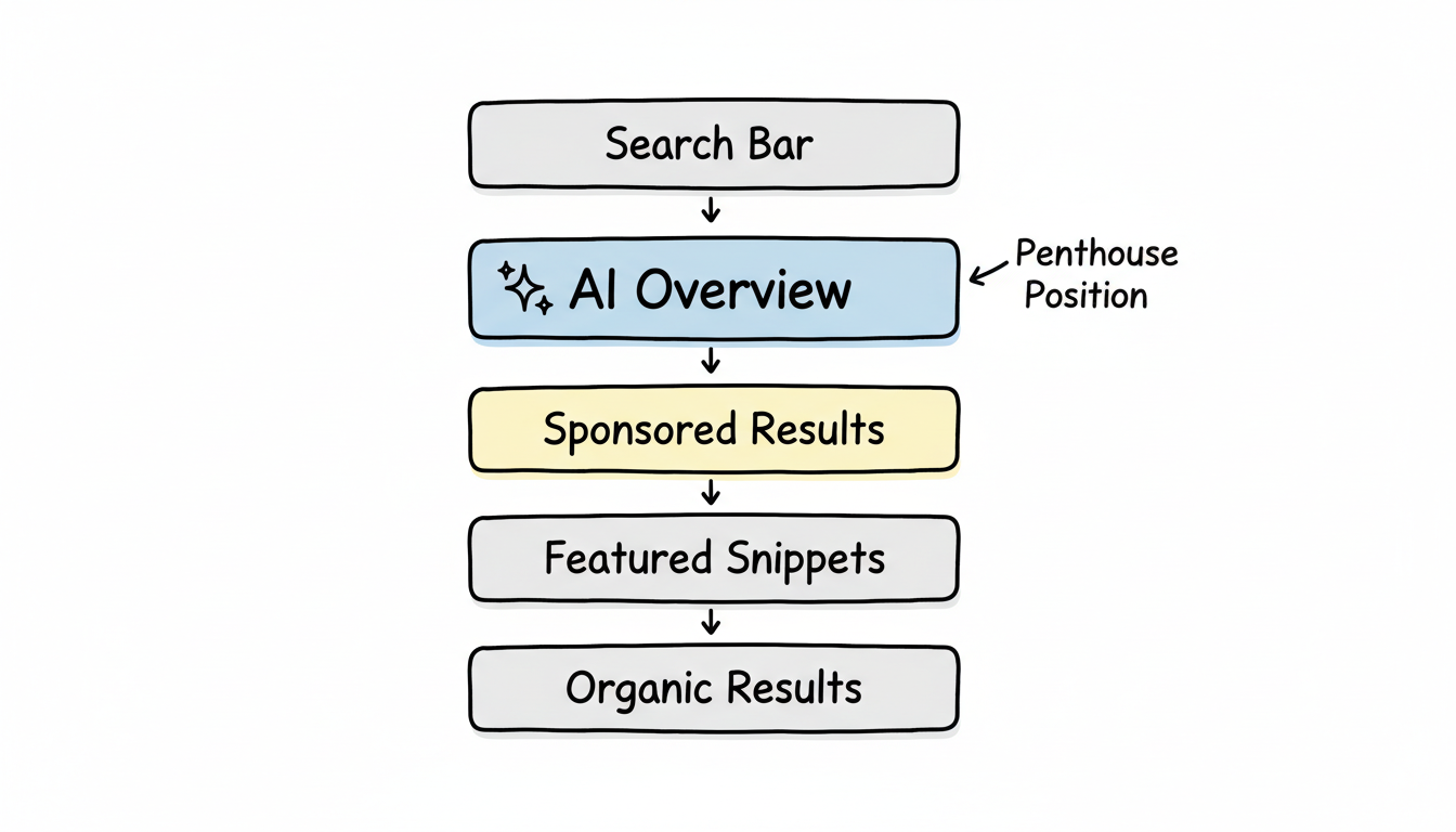
Google has made specific design choices for how AI Overviews appear in search results, distinguishing them from traditional organic listings and featured snippets.
AI Overviews occupy what designers call the "penthouse" position—the premium real estate at the top of search results.
According to Google's own documentation on AI Overviews, AI Overviews appear above traditional organic results, pushing conventional blue links further down the page. This positioning reflects Google's prioritization of AI-synthesized answers and represents a fundamental shift in how answer engines work.
Visual hierarchy:
Unlike ChatGPT's streaming text or animated responses, Google AI Overviews use a distinctly static presentation.
According to analysis of Google's AI design language, AI Overviews render as complete, static "snapshots" of information rather than streaming tokens. This creates a more authoritative, document-like feel compared to the conversational streaming of other AI interfaces.
Design characteristics:
AI Overview citations appear as compact reference links integrated into the response, typically showing domain names with small favicons.
Citation design elements:
Google's Gemini AI brand, which powers AI Overviews, has its own distinct visual identity that influences how AI features appear across Google products.
The Gemini logo combines typography with sparkle elements, incorporating gradient colors that suggest sophistication and intelligence.
Logo characteristics:
According to Google's design documentation, Gemini uses a distinctive color palette that signals AI functionality:
These colors create visual separation between AI-generated content and traditional search results.
Google's AI Overview design incorporates specific elements intended to build user trust in AI-generated content.
Elements that signal AI generation:
The static, comprehensive presentation style suggests authority and completeness. Unlike conversational AI that feels tentative, AI Overviews present information with document-like finality.
According to UX analysis of AI interfaces, Google's design choices represent "trust us" signaling rather than outcome-based design that proves value through results. The sparkle essentially asks users to trust that AI is helping them.
AI Overview visual presentation adapts across devices while maintaining consistent branding.
Understanding Google's AI visual language helps marketers in several ways.
When your content gets cited in AI Overviews, your brand appears through:
Unlike featured snippets where a single source dominates, AI Overview citations share visual space with multiple sources. Understanding these SearchGPT ranking factors helps optimize for visibility.
The penthouse positioning and static design influence how users interact with AI Overviews:
Content that matches Google's visual preferences for AI extraction:
Many marketers now leverage free AI content optimization tools to ensure their content aligns with these presentation requirements.
Google's AI branding continues to evolve as the technology matures and user expectations develop.
Emerging trends:
According to analysis of AI interface design trends, the sparkle icon's dominance may eventually give way to more explicit, text-based AI indicators as users demand clearer communication about when they're viewing AI-generated content. Companies exploring AI-powered search features face similar transparency challenges.
Understanding Google AI Overview visual design informs both user experience expectations and optimization strategy:
The visual design of AI Overviews reflects Google's strategic choices about how to present AI-generated content—as authoritative, trustworthy, and magical. For marketers, understanding this visual language provides context for how your brand appears when cited in these prominent SERP positions.
By submitting this form, you agree to our Privacy Policy and Terms & Conditions.